Wellness Trail
With Suzanne Chaney
Still in Step With the Trail. And Somehow, a Step Ahead.
At 82, Suzie didn’t set out to build a brand—she’s embodied it for decades.
What she wanted was a marketing tool that felt fresh, bold—and quietly powerful with presence.
What we created for Suzie wasn’t just a new site—it was something unexpected at first, and quietly unlike anything anyone’s ever seen.
This is wellness marketing without the noise, without the pitch. What resulted was a website that doesn’t push—it walks beside you.
Come see.
A Different Approach to Website Design
Suzanne Chaney’s Trail Into Horizontal Marketing
How the Trail Began
Suzie Chaney came to DuckByte at 82 years young, still hiking, still leading, still living her best life. She saw the Summit Living site we created for Bob Ferguson, a fellow Shaklee entrepreneur and longtime wellness advocate. Inspired by its community feel, she said, “I want one too.”
What the Trail Looked Like
Honestly, we love all of our sites—but we felt this one especially had a kind of magic woven through it.
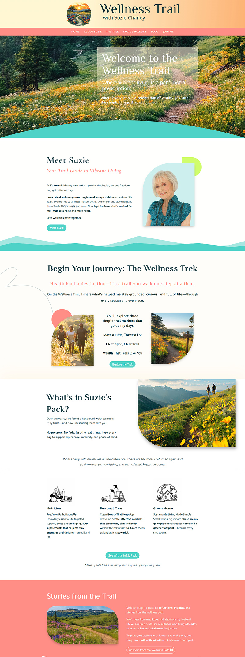
Suzie came to us with a bold palette—corals, aquas, and lively hues that we wove into a nature-forward layout using soft gradients, scenic imagery, and typography that breathes. Her color story didn’t just land—it danced.
The result? A site that feels like a golden-hour stroll—clean, inviting, and quietly inspiring. Built to feel good, not just look good.
An Invitation to Walk with Suzie as Your Guide
Suzie’s site is part of our ongoing work in horizontal marketing—a friendlier, community-centered approach to wellness entrepreneurship. Instead of pitching from a podium, it opens the door and says, “Here’s what’s worked for me. Come take a look.”
It’s an invitation, not a funnel.
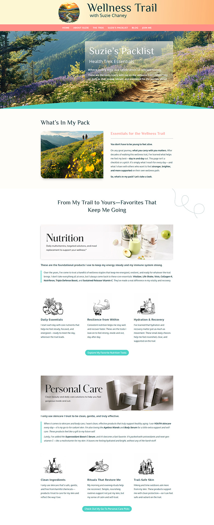
One of the standout features is her Packlist Page: a curated collection of her favorite Shaklee products. No splashy calls to action. Just Suzie, sharing what keeps her going strong, paired with reflections from her own journey. It’s Shaklee marketing, the DuckByte way—simple, soulful, and surprisingly effective.
The Unexpected Turn
When we handed Suzie the site, we were floating. We loved it. Loved it. It was elegant, heartfelt, and had just the right shimmer.
Suzie’s first reaction? “I thought it was going to look like Bob’s.”
Cue the sound of record-scratch and light heartbreak.
But after a couple weeks (and a few showings to friends), she came back with a smile:
“Everyone I’ve shown it to loves it. Never seen anything like it in a website before.”
— Suzanne Chaney
Sometimes you just have to walk the trail to realize how lovely it really is.
Trail Markers from the Build
- One of our most visually enchanting builds — bold inviting palette, clean layout, total serenity
- Voice-led copywriting that echoes Suzie’s grace, energy, and joy
- Packlist Page: wellness marketing that feels like a note from a friend
- Simple blog setup via email for easy updates
- Trail-inspired visuals that reflect her real-life lifestyle
- A quiet UX strategy to support slower-paced exploration and heartfelt discovery
Why We Stayed to Enjoy the View
Because it’s soft. Because it glows. Because it’s proof that good design doesn’t have to shout—it can walk beside you, say just enough, and still leave an impact with quiet presence.
This project reminded us that beauty lives in restraint. And that even Shaklee marketing can feel like a quiet walk through the woods when the tone is just right—steady footing, fresh air, and space to notice what matters.
Home page: a gentle welcome into Suzie’s world—soft Shaklee marketing with a personal touch.
Take a quiet stroll through the live site. →
Packlist page: Suzie’s Shaklee favorites, shared simply and sincerely—marketing that feels like a conversation. Take a closer look at Suzie’s Packlist →


