The Commons
With this project we have been present at the birth of an uplifting project for the betterment of all. Like most beginnings, they needed a logo and a look that is inviting and on message. We leveraged AI art tools to create a warm and welcoming site all on a tight budget.
Crafting Visual Narratives: Designing for Impact
Our work with The Commons, a nonprofit community organization with a lofty vision but a modest budget, highlights our expertise in transforming concepts into compelling visual stories through logo design, captivating graphics, and enhanced textual content. Join us as we reveal how our innovative design strategies empower nonprofits to expand their influence and inspire action.

Designing for a New Brand: Logo and Graphics
The Logo:
Establishing a strong brand identity often starts with creating a compelling logo that truly connects with your audience and effectively communicates your mission.
The client initially gave us a basic line drawing of two hands, which needed some enhancement to fully capture their vision. We worked closely with them to refine this hand symbolism into an image that represents inclusiveness. After that, we helped choose the perfect font that seamlessly fit their brand identity. Once we finalized the visual elements, we used Photoshop to add a sophisticated gold coloring. This approach brought everything together into a polished new brand identity that truly embodies their mission.

The Graphics:
We created an innovative online presence enhanced through the use of AI-generated graphics.
One challenge of not having any graphics or visuals at the start of this website design project led us to use AI text tools to create AI art prompts and the result of AI talking to itself. The creative use of these tools resulted in a vibrant color theme and look that included richly-colored onsite visual elements, beautifully representing the diversity and multiculturalism The Commons aims to highlight.
Delivering Engaging Design on a Budget: The Commons’ Success Story
The Commons team was thrilled with how we combined a smooth, collaborative process with an engaging aesthetic—while staying within a modest budget:
“Paul and Alesia were extremely helpful at every stage of the web design process, from ideation to back-end walkthrough and explanation. They are professional, efficient and extremely easy to work with, no matter your level of familiarity with the process, while also offering their services at a reasonable price. I would highly recommend them for all of your website/online needs.”
Bringing It All Together for The Commons
With their vision clearly defined, we moved on to craft a cohesive online presence, ensuring every page—from the homepage to the blog—aligned with The Commons’ mission. Expand each section to see how their design came together.
Designing an Engaging Homepage
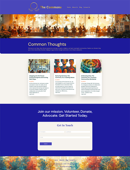
With very little text content, having a visually interesting homepage is crucial for capturing visitor interest and encouraging website visitor engagement.

Crafting a Visually Appealing Homepage for The Commons
We designed a visually appealing and rich homepage look for The Commons, integrating vibrant AI graphics to boost visual appeal and engagement. Our approach centered on preserving The Commons’ identity as a nonprofit initiative, vividly portraying their objectives and community-oriented missions. This homepage serves as the primary entry point to their website, designed to warmly welcome visitors with informative content that underscores the organization’s dedication to fostering positive social change.
Integrating Visual Design with Compelling Content and a Clear Call to Action
As the homepage serves as the gateway to their online presence, our design prioritizes intuitive navigation and compelling visual graphics. These elements are crafted to intrigue audiences, encouraging further exploration and ensuring a clear call to action for effective web engagement.
Timely Website Launch on a Tight Budget
Even with the need for a swift online presence, we focused on essential components like mission statements, team biographies, and a contact form.
Designing an About Us and Mission Page
Highlighting Values and Vision Through Human-Centric Design.
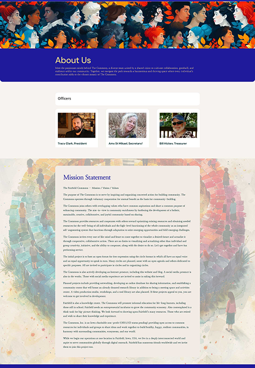
We developed an “About Us” page for The Commons, featuring photos and bios as well as a compelling mission statement. This page offers a human-centric design that provides visitors with a comprehensive understanding of the nonprofit initiative and its dedicated team. By showcasing the organization’s values and goals, the “About Us” page builds trust and fosters a strong connection with the community.
Navigating Rapid Development and Minimal Budgets
This nonprofit is aiming big, envisioning a future where their website grows into a strong platform that supports a wide range of initiatives. During our initial phase working together, we concentrated on quickly developing their site despite tight budgets. Despite these challenges, we managed to establish a solid foundation using a straightforward and efficient design approach.
Scaling Up Towards a Fully-Fledged Website
Now armed with the foundational design elements from phase one, we’re ready to scale up to a full-fledged website. This next phase includes enhancing functionality with features like membership systems, interactive tools, and robust content management. Our focus remains on user-friendly navigation, appealing aesthetics, and seamless integration of essential functions. Leveraging our initial design, our goal is to empower this nonprofit to expand online and support its community and organizational goals effectively.
Designing a Streamlined Blog Integration

Simplifying Blogging for Non-Tech Teams
We also added a user-friendly blog feature, specifically designed for team members who may not be tech-savvy. This setup allows team members to submit blog posts via email, which are automatically published on our website’s blog.
Empowering Grassroots Visionaries
This streamlined process not only makes content creation easier but also ensures we get timely updates from everyone within the organization. Plus, these blog posts are also repurposed for our newsletter, keeping our audience engaged with relevant updates and insights delivered directly to their inbox.
Efficient Content Management and Newsletter Engagement
By leveraging this dual-purpose approach, we’re not only enhancing our online presence but also strengthening our communication strategy. This helps us engage our community effectively and support our mission-driven initiatives more impactfully.
Experience the impact of DuckByte’s strategic web design. At DuckByte, we are dedicated to transforming inspired nonprofit visions into fast, affordable, and scalable online presences.
Get in Touch! Let’s discuss how we can assist your next project!


